Redesigned and Ready for Action
The Pride finally revealed their new jersey designs for Season 6, and they are FANTASTIC.
The team stuck with their classic gold base and logo for their home jerseys, but added a really cool horizontal striping pattern that feels reminiscent of the Montreal Canadiens' red jerseys have utilized for more than a century. It's a classic, clean look, though making the middle stripe silver or white would've really made the striping and the logo pop. I DO love the Pride Logo though, and I'm glad that they are sticking with it for their home jerseys.
I love that they went with a colored home and away. There is no need for a white jersey, society has progressed past the need for those, and I very often find them to be boring. But the team went with some really cool design choices. The away jerseys have a black to gold gradient on the sleeves and the waist, and it looks incredible. I think gradient jerseys are fabulous when done properly, and the important part about this one is that it's not the main attraction. There isn't too much happening elsewhere on the jersey either, giving it a really nice, clean look. I'm not a huge fan of the simple text logo - I would've liked to see a paw ripping through the jersey myself - but it is a unique font at the very least that we don't see a ton of elsewhere.
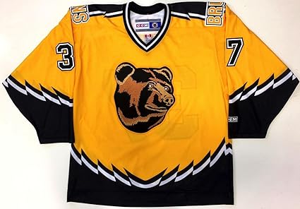
What do you think? Overall, I like that it's a black/gold combo. No whites needed. I was hoping for an adaptation of the famous Pooh Bear jerseys, but I'm admittedly a bit of a masochist with these things. But imagine this with a snarling lion's head instead of the bear?

Enjoy our content? Make sure you follow @PrideDiehards on Twitter to see all of our fantastic women's hockey content! If you are interested in writing for us, please send an email to sfascetta777@gmail.com.
By: Spencer Fascetta | Find me on Twitter @PuckNerdHockey


